It has been almost a month since Webflow introduced the " flexgap "in the Webflow Designer.
The flexgap allows you to add horizontal and vertical margins between elements, like a grid, but in a flexbox!
So... is this the end of grids?
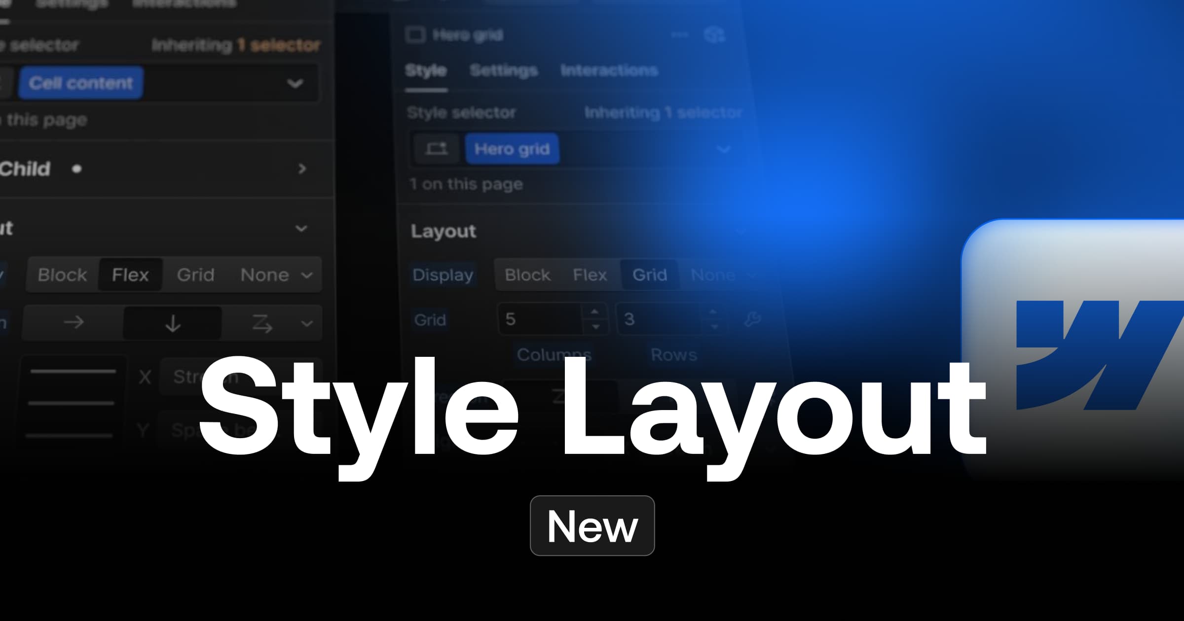
Flexbox vs Grid
I've been a big fan of using GRIDs in Webflow for a long time... but this new feature is changing the game.
I liked to use grids to ensure a balanced distribution between my elements and easily make them responsive by adding or removing columns but...
The new use cases of the Flexbox
So far I have encountered two cases of applications that allow me to speed up development speed or limit DOM stacking in Webflow thanks to this new flexbox spacing feature:
- Remplacer la <!-- fs-richtext-ignore --><div> margin + direction dans la méthodologie de développement client-first
- Replace a grid with a flexbox and organize the mobile responsive with horizontal or vertical direction
Moreover... This new version of the flexbox layout seems to me much easier to use than a grid for a client who is not familiar with Webflow.
Conclusion
My first tests of this new flexbox gap feature encourage me touse itmore and more often and to re-challenge my way of building in Webflow. The Flexbox Gap completes the arsenal of CSS Layout offered by a flexbox, which now covers, in my opinion, 360° of the needs in terms of web design.
So I think we can expect to see the flexbox gap becoming more common in sites developed with the Webflow CMS.
To be continued...
Ready to take your website to the next level?
Improve your online visibility thanks to Digidop's experience, excellence and reactivity!


.webp)
.webp)

