Responsive web design is essential to providing a smooth and optimal user experience on your site, regardless of the type of device being used. Whether your visitors are browsing on a smartphone or a large computer screen, it's crucial that your site fits perfectly on all screen sizes.
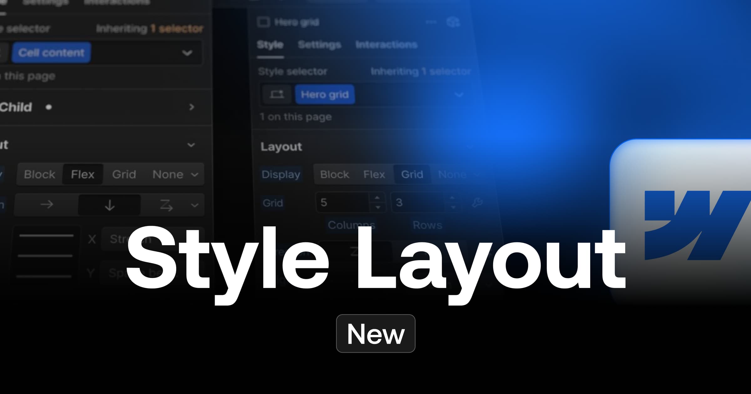
When creating your website with Webflow, you can achieve this level of flexibility by using different viewport CSS units. The viewport is the size of the browser window where your web page is displayed. However, a challenge arises with some mobile browsers that have dynamic "navigation bars". These navigation bars appear and disappear depending on how the user scrolls down the page, which can disrupt the display of your website if your CSS uses VH or DVH units.
Fortunately, to avoid this problem, Webflow offers specific viewport units!
What are viewport units on the web?
The viewport units are determined according to the size of the screen. The classic viewport units are VH (Viewport Height) for the height and VW (Viewport Width) for the width. However, these units do not take into account the dynamic navigation bars of mobile browsers. If you use these units to define elements at 100 VH or 100 VW, they may overflow the viewport on browsers with dynamic navigation bars (especially on mobile, for the responsive part of your website).
To avoid this, it is best to use "min or max" viewport units, as well as "dynamic" units to ensure that all elements of your site remain perfectly visible.

List of viewport units :
- DVH - relative to the height of the dynamic viewport
- DVW - relative to the width of the dynamic viewport
- SVH - related to the small height of the viewport
- SVW - related to the small width of the viewport
- LVH - related to the viewport's great height
- LVW - related to the large width of the viewport
- VH - relative to the height of the viewport
- VW - related to the width of the viewport
Units with a prefix LV correspond to large viewports, i.e. the viewport area visible when a dynamic navigation bar is hidden on a mobile browser. Units with a prefix SV correspond to small viewports, i.e. the viewport area visible when a dynamic navigation bar is present on a mobile browser.
How to use these units to create a responsive website?
In Webflow, when entering units in a field, you will not find the units SVH, SVW, LVH or LVW in the drop-down menu. To use them, simply type the value and letters of the unit you want to use (for example, 100 SVH) into the input field and press Enter.
Best practices for the use of viewport units
It is advisable to set a minimum height with SVH, rather than simply setting the height of the section. This way, the section respects the content inside and adjusts accordingly. For example, if you set the minimum height of your hero section to 100 SVH, the hero section will occupy the entire viewport (even with a dynamic navigation bar) but can also expand depending on the content inside.
Bonus: how to easily modify all your CSS classes with a DVH or VH value from the Webflow designer?
- Open the Webflow designer
- Open the Style Manager
- In the "Search Classes" bar, type "DVH" or "VH".
- That's it! You have now identified all the classes of your Webflow site using the DVH or VH units.
.webp)
Conclusion on best practices with Webflow
Keypoints:
- Never set a fixed height for your section
- Use the "min height" value instead
- Favour the use of dynamic pruning such as the SVH
By understanding and properly using viewport units in Webflow, you can create a truly responsive web design that provides an optimal user experience on all devices. Don't forget to test your site on different browsers to make sure these units are compatible with your target audience's browser.
In addition, here is a great video explaining the best practices by Webflow
Ready to take your website to the next level?
Improve your online visibility thanks to Digidop's experience, excellence and reactivity!


.webp)
.webp)

