Discover the power of Quick Stack, Webflow's revolutionary feature that combines the agility of Flexbox with the robust structure of Grid. Whether you're new to the world of web development or simply looking to simplify the structuring of your content, Quick Stack is here for you.
In this article, dive into the fundamentals of Quick Stack, learn how to add, customize and optimize it to create stunning, responsive designs. Get ready to master the basics of Flexbox, Grid and Webflow with Quick Stack, and transform your web design experience.
Understanding the Quick Stack concept
Flexbox and Grid: The foundations of Quick Stack
When it comes to structuring the content on your website, two main techniques stand out: Flexbox and Grid.
Flexbox offers impressive flexibility for arranging elements in a single direction (find out more about the flexbox gap), while Grid enables powerful two-way layout (columns and rows).
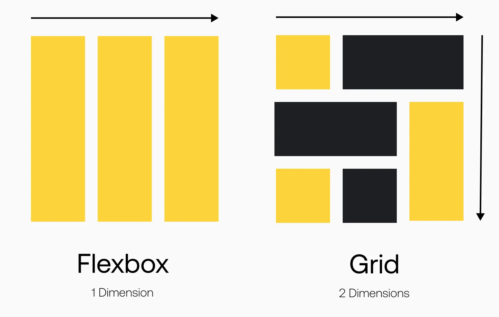
Quick Stack combines these two approaches to give you the best of both worlds. With Quick Stack, you can create complex content arrangements using flexible cells, while benefiting from the solid structure of the grid. This means you can create responsive, aesthetically pleasing layouts, even if you're new to web development.
The benefits of Quick Stack
Quick Stack offers many advantages for beginners and professional web designers alike. Firstly, it simplifies the content structuring process, saving you time and energy.
By using predefined presets or manually adjusting cell sizes, you can easily create layouts tailored to your needs.
What's more, Quick Stack is fully responsive, meaning your designs will adapt seamlessly to different devices and screen sizes.
Combining the flexibility of Flexbox, the power of Grid and the user-friendliness of Webflow, Quick Stack is an essential tool for anyone looking to create outstanding designs.
Discover also Fluid Responsive.
Quick Stack tutorial in Webflow
Adding and customizing Quick Stack in Webflow
Now that you have a basic understanding of Quick Stack, it's time to apply it in Webflow. Follow these simple steps to integrate and customize Quick Stack on your site:
Step 1: Open the Webflow designer
To get started, log in to your Webflow account and open the designer. Make sure you have selected the project in which you wish to use Quick Stack.
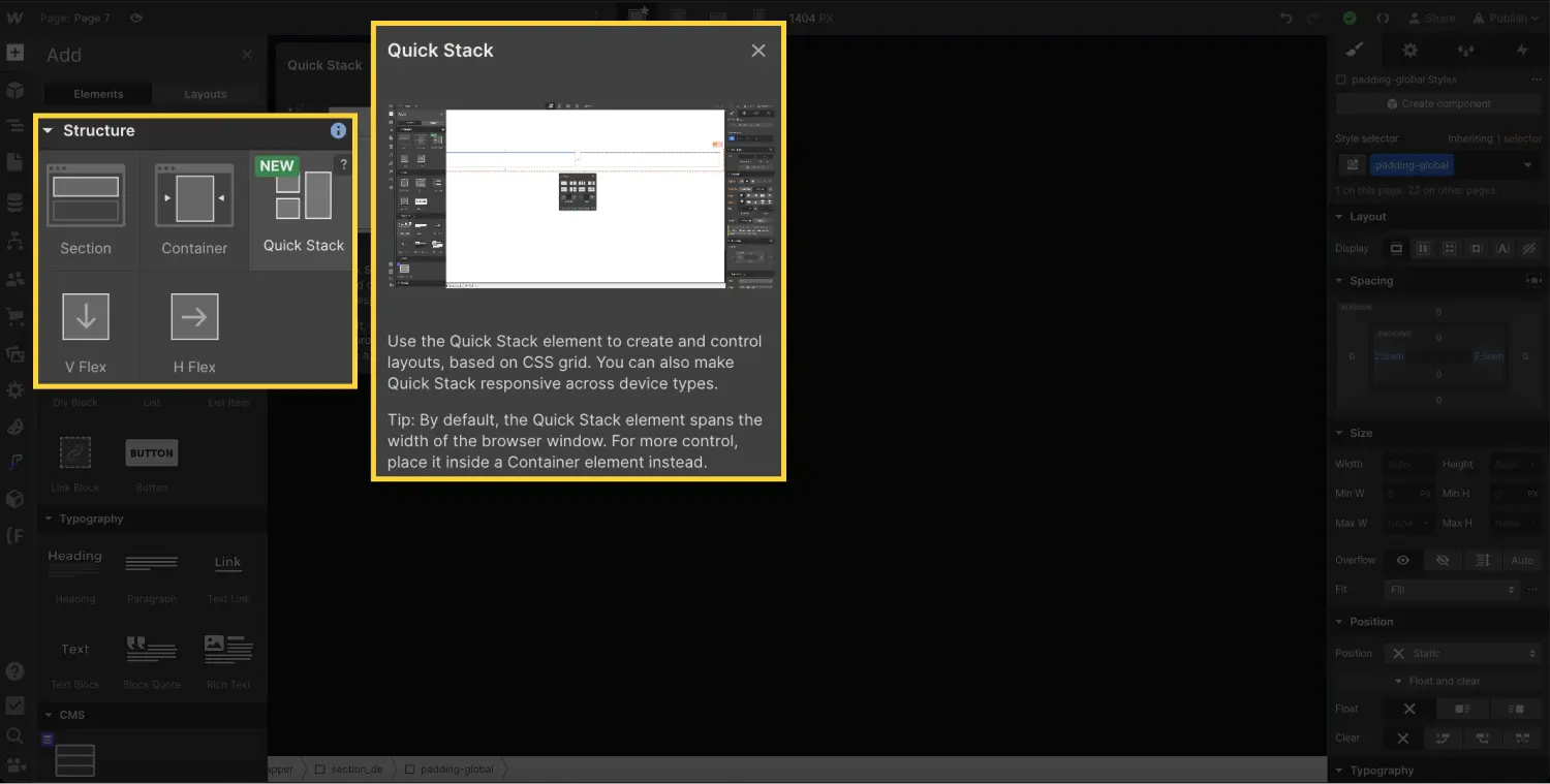
Step 2: Add a Quick Stack element to your canvas
In the toolbar on the left of the interface, click on the"Add item" icon. Then look for the "Quick Stack" option in the list of available elements. Drag and drop the element into your project.
Step 3: Choose the structure of your Quick Stack
Once you've added the Quick Stack element, a menu of presets will appear, allowing you to choose the structure of your choice. Browse through the various options and select the one that best suits your layout vision.
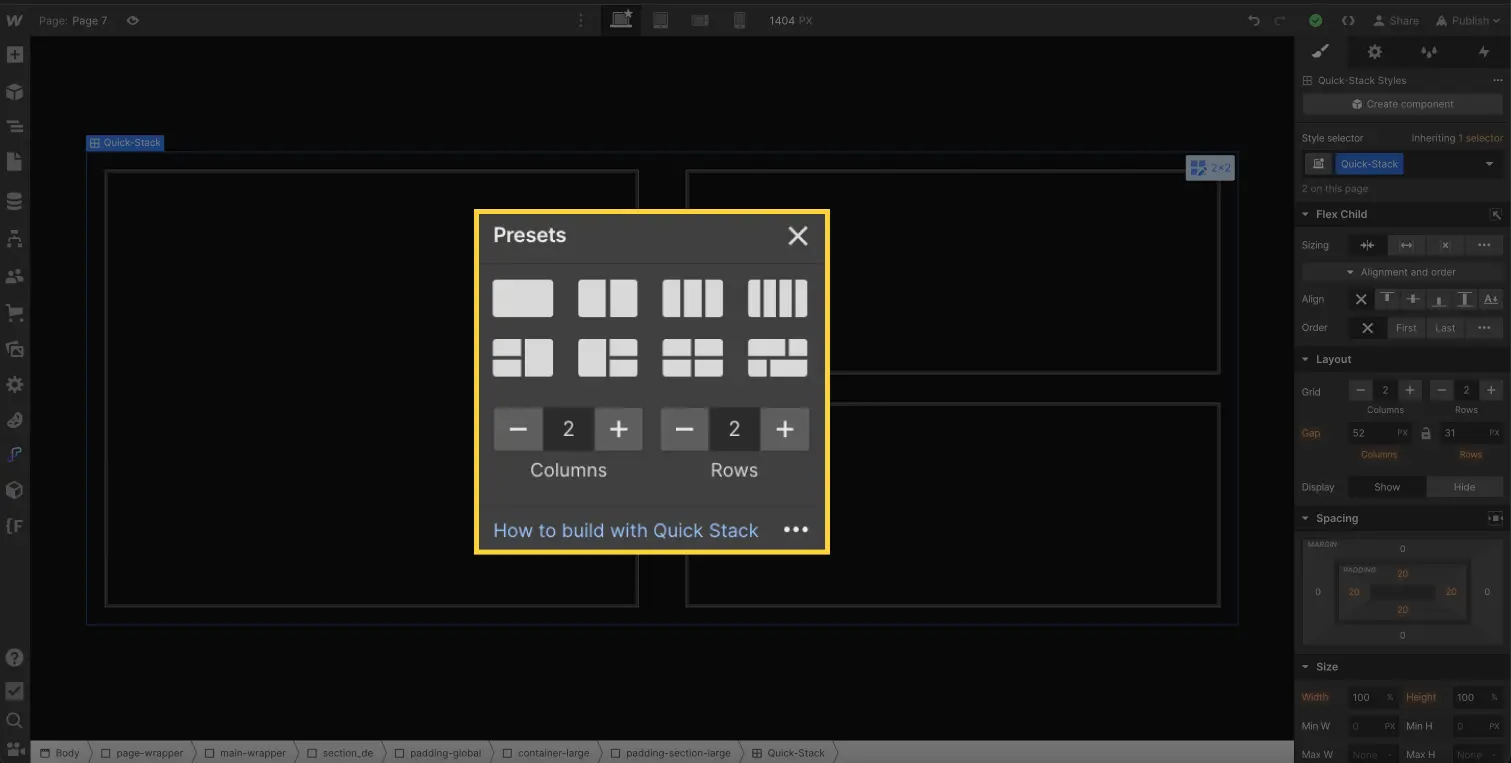
You can easily add a row or column and change the distance between columns and rows in the element's style bar.
You can also edit the style directly in the canvas by clicking on the icon associated with the element and adding a column or row and modifying the gaps between columns and rows.

Step 4: Customize your Quick Stack cells
Now that you've defined the structure of your Quick Stack, you can start adding content to the individual cells.
Click on each cell to insert elements such as text, images or videos. Use the available style options to adjust cell size, spacingand display to suit your needs.
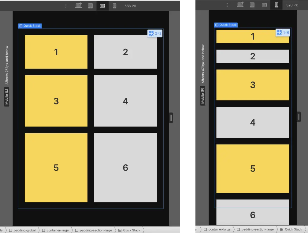
Optimizing Quick Stack for different breakpoints
One of the major advantages of Quick Stack is its ability to adapt to different breakpoints, ensuring a consistent user experience across all devices.
As you move from one breakpoint to another in Webflow, you'll notice that the line options automatically adjust to fit the content of your Quick Stack. However, don't forget to check and adjust the layout and cell dimensions for each breakpoint to ensure optimum appearance on all screens.
It's a very practical and easy-to-use element for a perfectly responsive website.
Advanced tips for impressive designs
To take your use of Quick Stack even further, here are a few advanced tips.
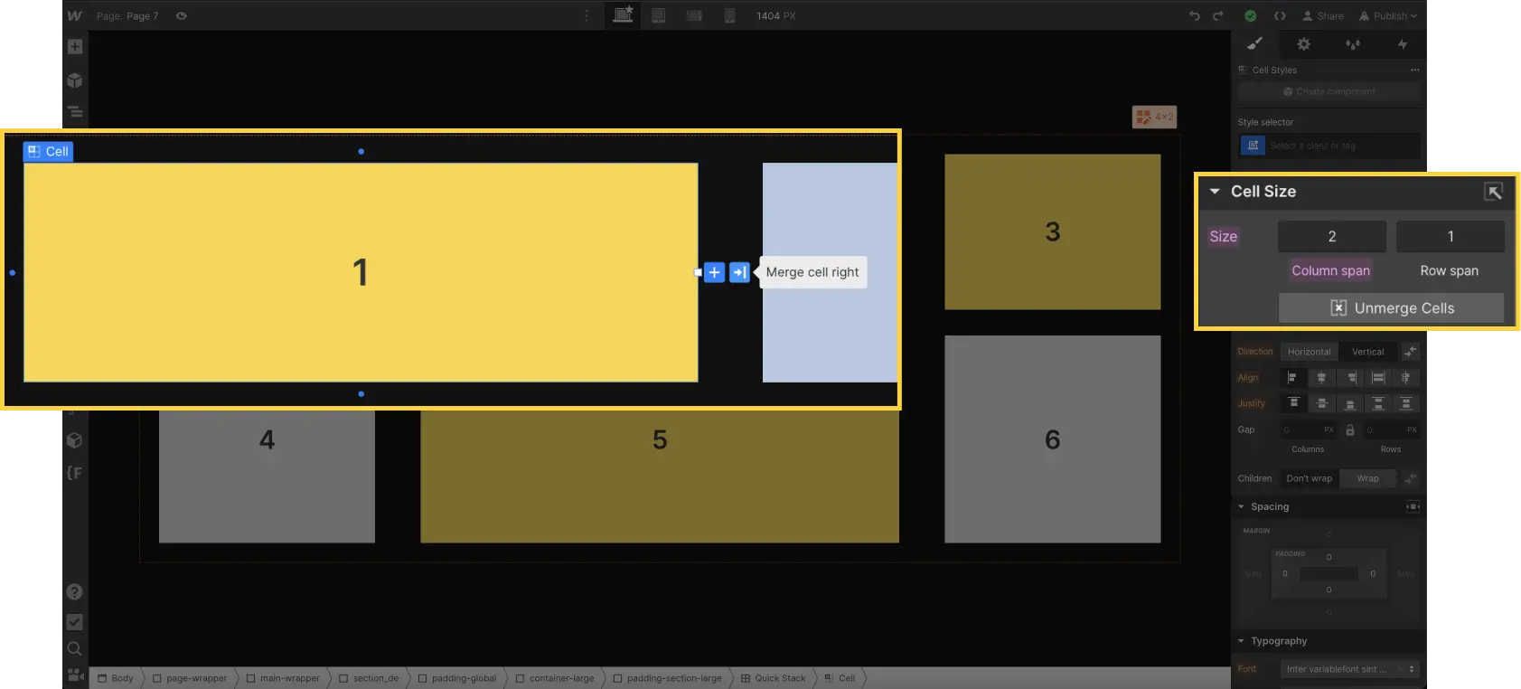
Merge or Split cells
You can merge and separate cells to create unique layouts. You can also use the order options to control the layout of your cells (like elements in a grid).
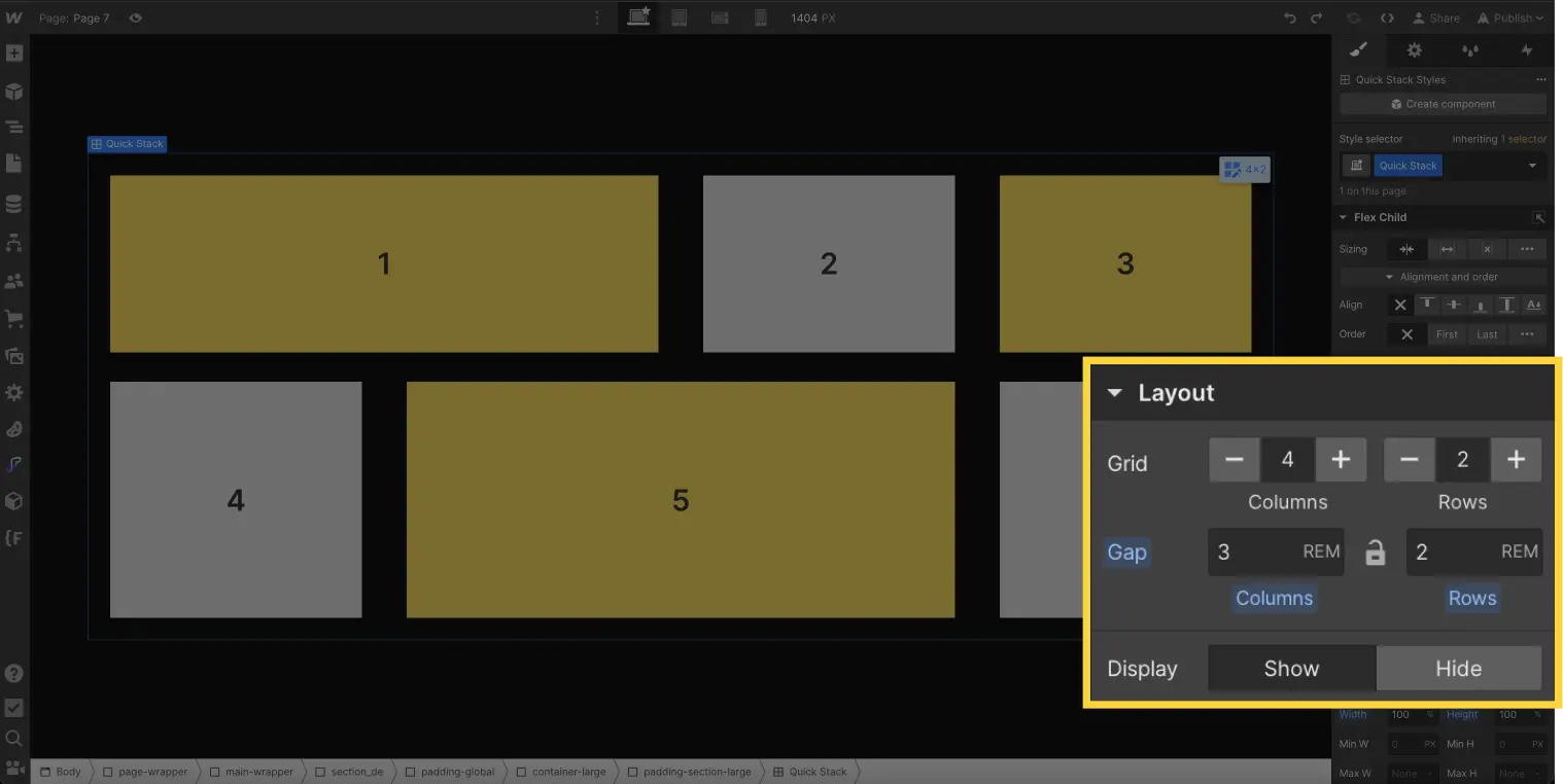
Adjust row and column sizes
Adjusting row and columnsizes in Quick Stack is simple and powerful. By default, each column has a size of 1 FR, ensuring a fair distribution of available space. Rows are set to"auto", allowing cells to adapt automatically to their contents.
But that's not all! You can also define minimum (min) and maximum (max) values for rows and columns, just as you would with Grids. By accessing Edit mode, you can click on a row or column header to access the context menu and specify min and max values for fine-tuning the size.
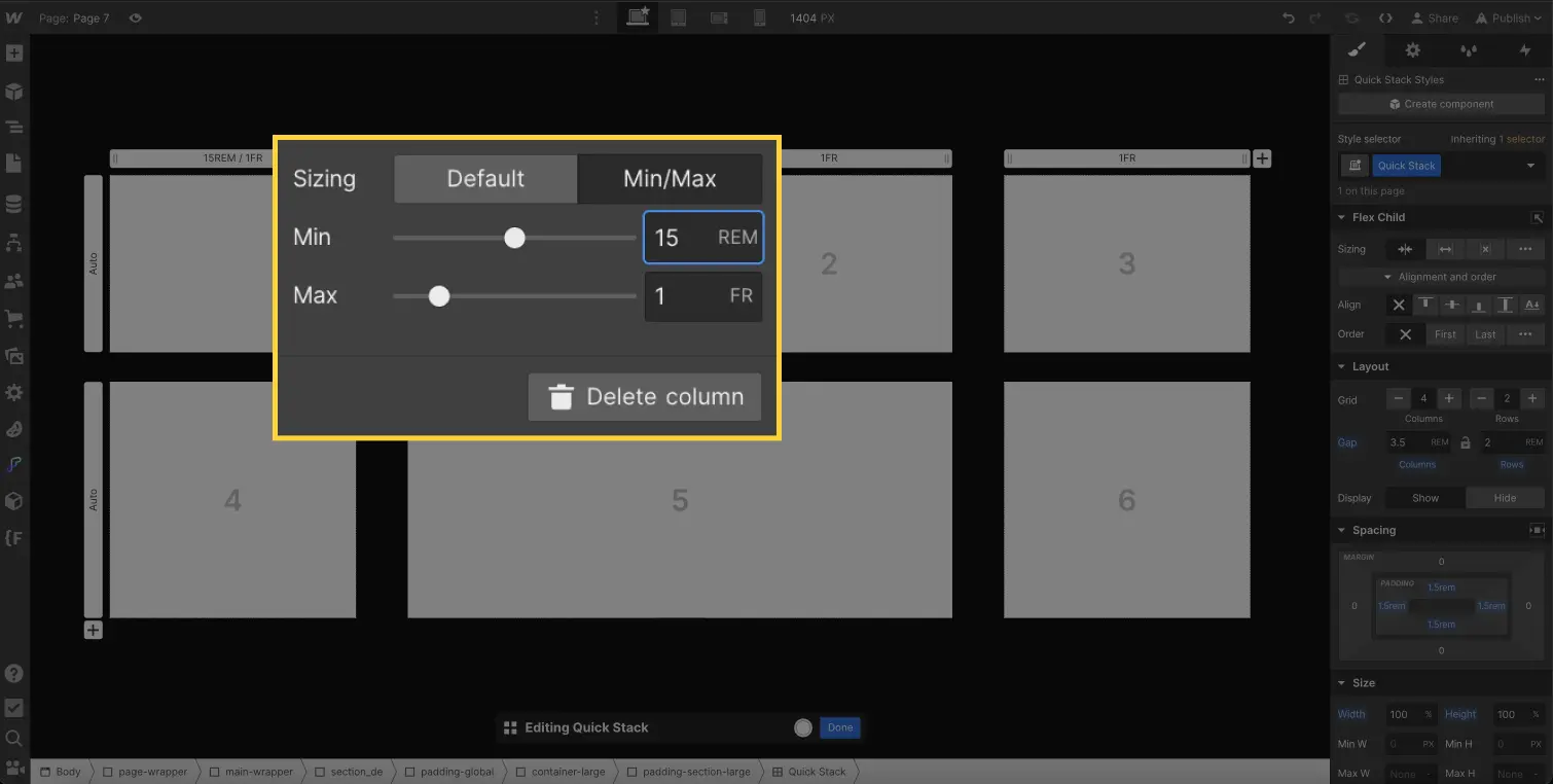
This means you have total control over the layout of your content. You can create larger or smaller sections by setting limits, allowing you to achieve a harmonious presentation tailored to your needs.
With Quick Stack's sizing functionality in Webflow, you can easily design flexible, responsive layouts, while delivering an optimal user experience.
In conclusion, by integrating Quick Stack into your arsenal of Webflow skills, you'll be able to design modern, dynamic layouts with ease. This powerful feature offers exceptional flexibility and adaptability, enabling you to create attractive, responsive designs without compromising the user experience.
Whether you're a beginner looking to explore new design possibilities, or a seasoned professional looking to optimize your workflow, Quick Stack will be with you every step of the way. By simplifying column and row management, as well as style customization, Quick Stack will save you time and deliver impressive results.
So dive into the world of Quick Stack in Webflow and let your creativity run wild. Get ready to bring your ideas to life and create captivating visual experiences for your users.
Learn more about Quick Stack by Webflow.
Ready to take your website to the next level?
Improve your online visibility thanks to Digidop's experience, excellence and reactivity!


.webp)
.webp)

