Today, we are going to learn the basics and the notions to learn how to do Webdesign in Webflow. The design part is a great advantage of Webflow compared to its competitors since it is basically a tool for web designers. Thanks to this nocode website creation tool, we can make each page of our website unique.
Understanding Webflow's responsive
Before starting, it is necessary to talk about design for mobile in Webflow. Indeed, before starting to create your website, you have to look for a platform that will allow you to design in mobile first. This is quite possible with Webflow, which allows us to make responsive and personalized designs.
In fact, Webflow works with a cascadingrules system. This system works in such a way that the design of a "superior" device type influences all those "below" it. However, a change made to one device type does not affect the design of the device types "above" it. The current hierarchy in Webflow is as follows: Desktop > Tablet > Mobile Landscape > Mobile Portrait. So, when I design the Desktop version, the modifications are also done on Tablet and Mobile. Conversely, if I make a change on Mobile Landscape, it will influence Mobile Portrait, but not Desktop and Tablet.
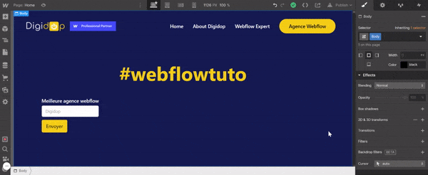
Learn how to use the Webflow Style Manager
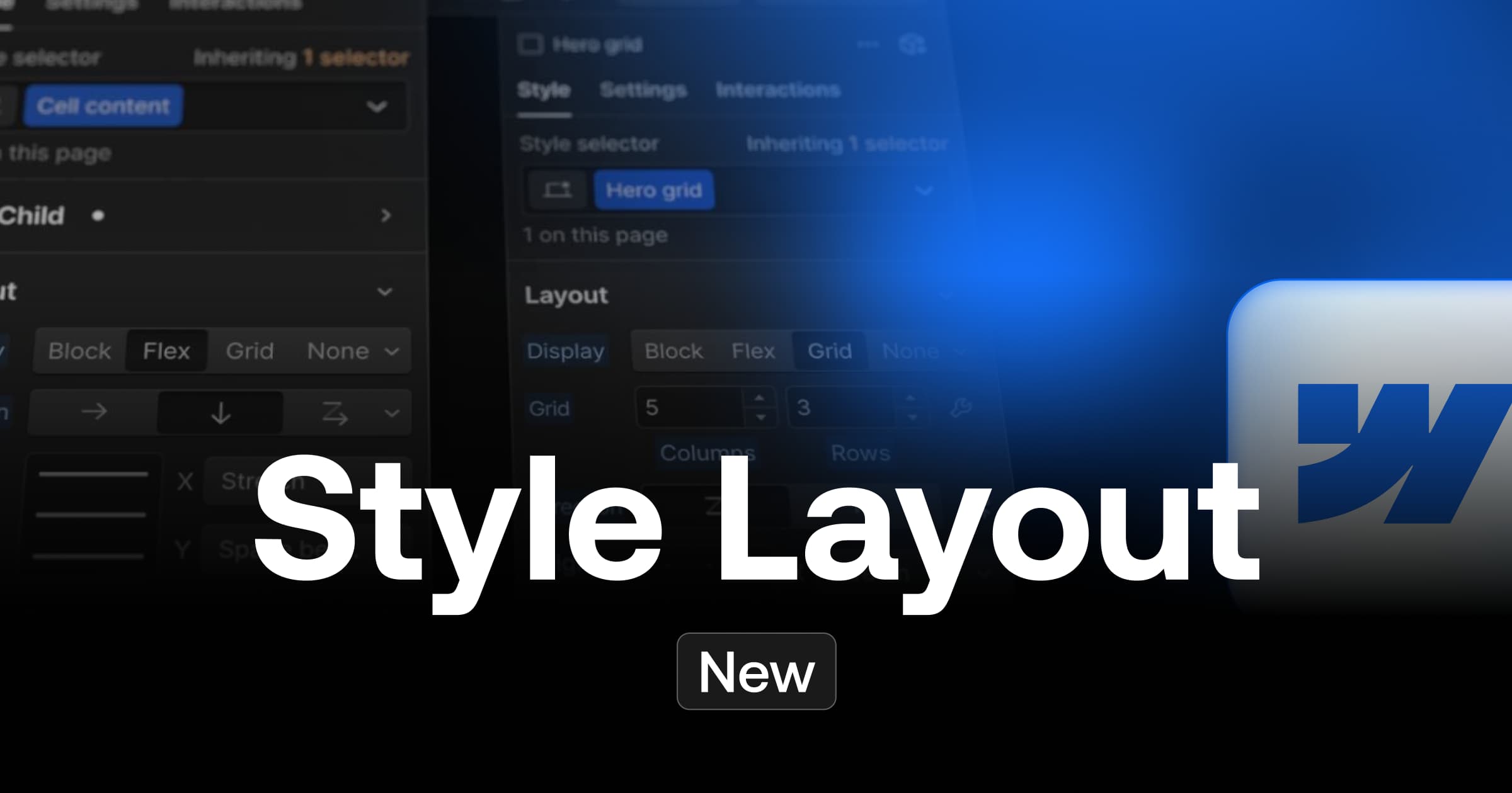
The Webflow style manager corresponds to the right side panel which allows you to assign classes to the elements of your page and to style them(keyboard shortcut: "E").
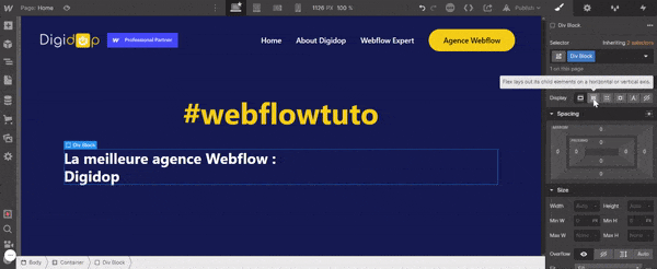
Understanding the Purpose of the Selector
The Selector allows you to assign a name to an element that you select to give it a style and thus create a "Class". A "Class" is a type of selection which makes it possible to assign the same style to all the elements of this one.
It is possible to combine several classes to customise elements. We call these "Combo Classes". A "Combo Class" allows you to combine two or more classes to apply different styles to an element.
In addition to this, it is possible to change the style of an element when it is hovered, pressed or focused using the "Selector State" function.
With a good Style Guide and a Client First methodology, the Selector will save you considerable time in developing your project.
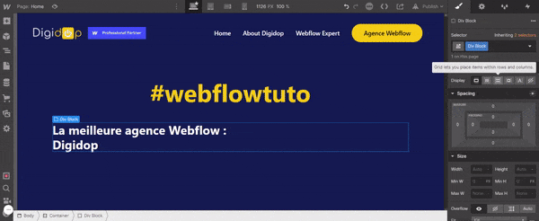
Customize the display of its elements with the Layout section
The Layout feature in the Style allows you to arrange the elements of a page in several ways:
Display: block
This layout displays the elements of the block on a new line. They occupy the entire available width.
Display: flex
This layout allows you to arrange the elements of a block horizontally or vertically. Additional options are available to justify or align the elements.
Display: grid
This layout allows you to display items in a grid. You can choose the number of columns and rows to customise the grid and therefore the display of your items.
Display: inline
This layout allows one element to be displayed next to another without a break. The margins can be changed, but not the height or width.
Display: inline-block
This layout allows elements to be displayed side by side. The width of this element is determined by the content it contains.
Display: none
This layout simply hides the elements of your page.
Define gaps and margins with the Spacing section
In this section, it will be possible to define margins and padding between the elements of the page. More concretely, the margins define the external spacing between the border of an element and the surrounding elements. The padding defines the internal spacing between the border of an element and those inside.
Left margin
Defines the external spacing between the left border of an element and the surrounding elements.
Left padding
Defines the spacing between the left border of an element and the elements it contains.
Bottom margin
Defines the spacing between the bottom border of an element and the elements below it.
Bottom padding
Defines the spacing between the bottom border of an element and the elements it contains.
Right Margin
Defines the outer spacing between the right border of an element and the elements adjacent to it.
Right Padding
Defines the inner spacing between the right border of an element and the elements within it.
Top Margin
Defines the outer spacing between the top edge of an element and the elements above it.
Top Padding
Defines the inner spacing between the top border of an element and the elements within it.
Define the size of the elements with the Size section
The "Size" section allows you to give a defined height and width to elements. Several functionalities are present and can be defined in pixel (PX), percentage (%), emperial unit (EM), root emperial unit (REM), character width (CH), viewport width (VW) or Viewport Height (VH).
Width
Width defines the width of an element.
Height
Height defines the size of an element.
Minimum width (min w)
Min W defines the minimum width of an element.
Minimum height (min h)
Min H defines the minimum height of an element.
Maximum width (max w)
Max W defines the maximum width of an element.
Maximum height (max h)
Max H defines the maximum height of an element.
Define the position of elements in Webflow
The "Position" section of the "Style" tab will allow you to customise the positioning of your elements.
Customize texts with the Typography section
This section will allow you to change the font family, size, alignment, colour etc. of your text. Fonts are directly available in Webflow, but you can import your own fonts (custom font).
Font
Modify your font
Weight
Change the line width of your font
Size
Change the font size
Height
Change the vertical space between lines
Color
Change the text colour
Align
Change the alignment of the text
Style
Change the text decoration
There are a lot of other customisation options available, but you can fully customise your text.
Change the background with the Backgrounds section
The "Backgrounds" section allows you to modify the background of an element. Thus, it is possible to insert an image, a gradient or a fill colour for the background of an element.
Adjust the borders with the Borders section
This section allows you to style the borders of an element. You can change the style, colour or radius of the borders of an element.
Create effects with the Effects section
Finally, this last section of the "Style" tab allows you to modify the appearance of an element by adding an opacity, a certain size, a rotation, a shadow effect etc.
There you go, you now know the elements of the Style tab in more detail! You can now start designing your website. If you need help with your Webflow project, Digidop is an expert agency in this tool.
Ready to take your website to the next level?
Improve your online visibility thanks to Digidop's experience, excellence and reactivity!

.webp)
.webp)

