Webflow's designer offers many features to customize the look and feel of your website on different screen sizes and devices. The no-code development tool allows to create responsive sites thanks to its cascading system.
Natively in Webflow, on all types of devices, it is possible to resize horizontally the size of your project in pixels. We can thus see how our site looks like on a 1200px or a 2000px width for a computer for example. However, it is not natively possible to touch the height of the project. This can be annoying when testing different versions on smartphones. So we will show you how, thanks to Finsweet, you can resize your Webflow project vertically!
Step 1: Download the Finsweet extension
Finsweet (one of the best known Webflow agencies in the world) has recently released a chrome extension for Webflow. This extension offers several useful features when developing in Webflow. You can in particular :
- Rearrange the colours in your palette
- Delete breakpoints
- Rearranging your symbols
- Converting pixels to REM
- Disconnecting all fields from a CMS
- etc.
This free plugin allows you to optimize your productivity in Webflow and to learn new things to create your website (the installation is done in 2 clicks).
Thanks to theFinsweet extension, you will be able to vertically resize the screen of your project in the Designer.
Step 2: Go to your Webflow project
Once you have downloaded the extension, you can access Webflow and enter your project. You will then see a small icon with the Finsweet logo added in the left bar. By clicking on it, you have access to all the features for Webflow offered by the online extension.
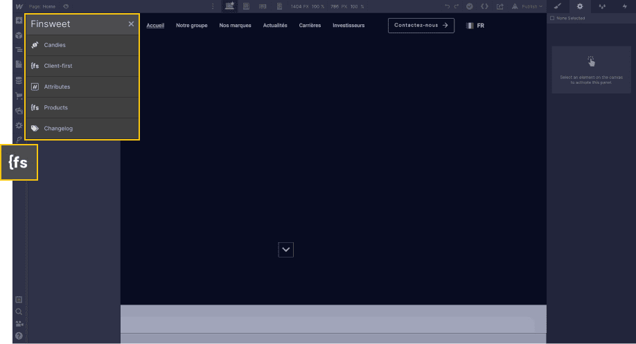
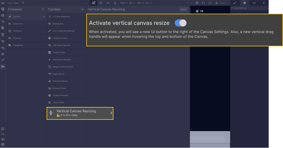
Step 3: Select "Vertical Canvas Resizing
Once you have clicked on the extension in Webflow, you will be presented with several options. In our case, you will choose "Candies" and then "Vertical Canvas Resizing". You will then need to check a toggle button to activate the feature.
Step 4: Resize the screen height
When you have checked the option, you now have the possibility to resize your Webflow screen vertically. From there, two methods are available to you:
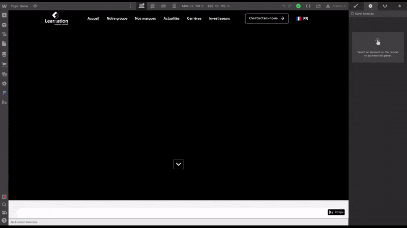
4.1 Adjusting the height with a mouse
Just like horizontal resizing, you can adjust the height of your screen with your mouse by dragging one end of the screen up or down.
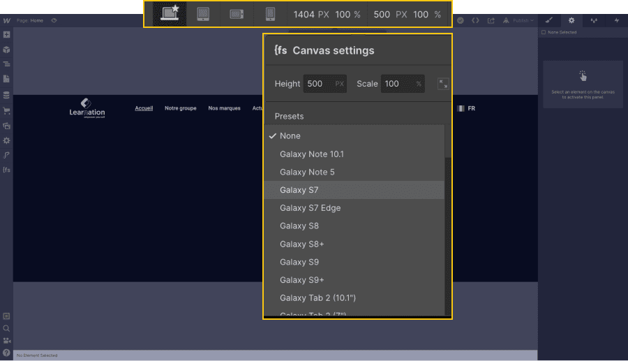
4.2 Adjusting the screen height with pixel values
Alternatively, to the right of the horizontal dimensions of your screen, in the top panel, you can set a specific height for your project. In this tab you will also find presets for different types of smartphones.
With our quick and easy guide, you can now get an idea of what your site will look like on different screen types with the ability to add custom width and height dimensions!
For more tutorials on Webflow, you can check our articles about the tool!
Ready to take your website to the next level?
Improve your online visibility thanks to Digidop's experience, excellence and reactivity!


.webp)
.webp)

