In our Webflow tutorial of the day, we will see how to limit the number of items on tablet or mobile or according to a specific screen size.
Example of a use case for its Webflow site
Let's say you have a desktop collection that has a limit of 5 items and your collection list is a 5 column grid display.
It may be that this layout works very well on Desktop, but from the tablet version onwards, your items are too compressed in this grid.
You could switch from columns to rows or use another type of display.
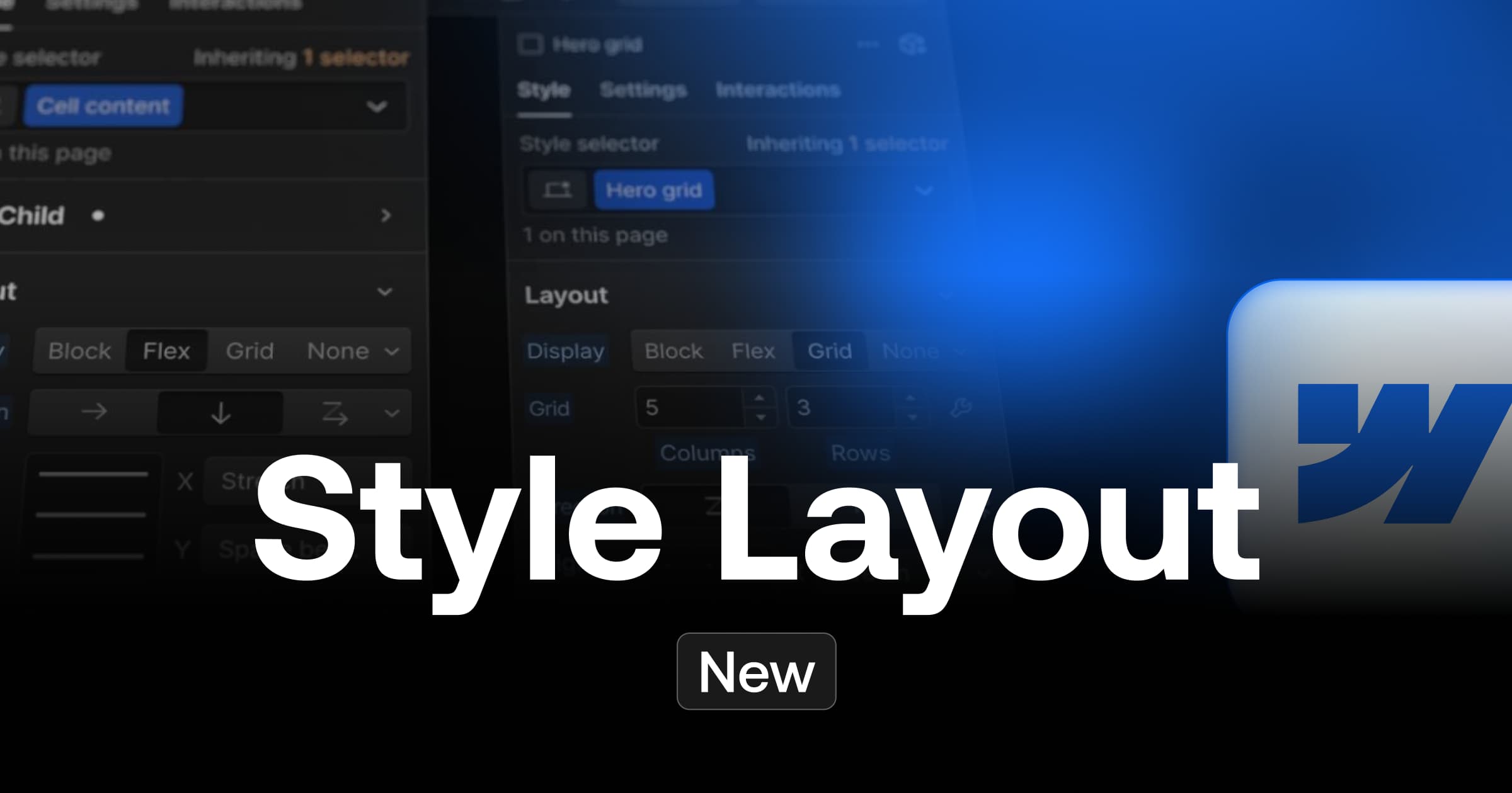
The different types of element display in Webflow
However, this may impact your design and you figure that 3 items from the tablet version would be an ideal limit.
Tutorial in Webflow
Step 1: Insert a collection
The first step, if you haven't already done so, is toadd a collection to the place you want in your page. You can then customize it as you wish.

Step 2: Add an item limit
After inserting and customizing your collection, you will need to set an item limit to the collection. To do this, you will need to:
- Select your"Collection List Wrapper" or "Collection List" or "Collection Item" item
- Go to the element parameters
- Click on"Limit items" in the "Display Limits" section
- Set a limit in Show (with our example above, our limit would be 5)

Step 3: Give a class to the collection list element
Once you have added an item limit, you can define a class for your "Collection list" item (if you haven't already). For example, we could give it the class "blogpost_collection-list".

Step 4: Add CSS code
Une fois votre collection list renommée, vous pouvez insérer le code suivant dans votre projet. Si vous souhaitez que votre projet soit optimisé au maximum, il est recommandé de mettre le code CSS dans les balises Head de votre page (inside <!-- fs-richtext-ignore --><head> tag). Il faudra alors publier le projet pour pouvoir constater les modifications.
You can also add an embed element to your page, and paste the code into it to see the change directly in the Designer.
You can of course modify this code according to your needs:
- You can change the min-width to apply the changes to larger or smaller screen sizes.
- You can modify .blogpost_collection-list to match the class name of your item list.
- You can change the "n+4" to another number to hide more or less items.

This little piece of code will allow you to vary the number of items you show according to a specific screen size and avoid design problems on some devices.


If this tutorial helped you, you can discover other interesting tips to develop in Webflow.
Ready to take your website to the next level?
Improve your online visibility thanks to Digidop's experience, excellence and reactivity!


.webp)
.webp)

